When creating a questionnaire, there are 2 main types of questionnaires which are commonly chosen to be used, these are open and closed questionnaires. An open questionnaire, is when the question being asked is not a 'yes or no' answer, it usually asks the audience to go into further detail into their answer so that you can get as much information/data as possible. A closed questionnaire, is when the question being asked is normally either a 'yes or no' answer. The format of these questionnaires are usually 'ticky boxes' or where you have to 'circle the answer', as they do not require you to write you answer in. An open questionnaire is better at collecting more detailed data, but is more time consuming for you and the audience, as it will take you longer to process the data, and it will take the audience longer to answer it, whereas a closed questionnaire collects the data you were intentionally looking for and is less time consuming again for both you and the audience. The data will take less time to process and the audience can quickly fill in the questionnaire by either ticking or circling their answers.
Although the closed questionnaire is less time consuming, i am using the open questionnaire for my final and overall questionnaire which i will give to people within my primary target audience so that i can find out if what i have created reaches my targets i set myself before i started my magazine. I want to know exactly what the audience has to say, which i why i am using the open questionnaire.
Tuesday, 31 December 2013
Sunday, 29 December 2013
Friday, 27 December 2013
Wednesday, 25 December 2013
Monday, 23 December 2013
Sunday, 22 December 2013


Saturday, 21 December 2013
'Question Style' Inspiration (Double Page Spread/Article)

This is an article page created by NME music magazine. I was inspired by this double page spread because of the question style it follows, i find that the 'question and answer' format which is used in this article is more effective for being able to find out more information about the artist(s) that it features. Since my intention for my double page spread article is to help inform the audience about 'PIKK 'N' MIX', let the audience get to know them more and to be able to find out things they never would have known (exclusives etc.).
Friday, 20 December 2013
Double Page Spread Questionnaire Results
https://www.surveymonkey.com/results/SM-WR8DSMM/

This is the second draft of my double page spread, since the first draft, i added page numbers, release date, magazine web address, a tagline/headline for the article to give the readers a taste of what they should expect to read in the article before they read it. I also added an advertisement for the audience to purchase the girl band 'PIKK 'N' MIX's new album on ITunes.
Thursday, 19 December 2013
Questionnaire: Double Page Spread
Now that you have seen the first draft of my double page spread, could you please Click here to take survey and i will post the results soon, thank you.

Wednesday, 18 December 2013
Overall Photo I Have Chosen For My Double Spread Page

I have decided to use this photo for my double page spread, as I believe this image shows how close the 3 girls are, which is highly relevant to my article as in the article it talks about how close the girls are, what they have conquered together and what they have achieved over their lives together. Therefore, I believe this image is helping back up what is being said in the article.
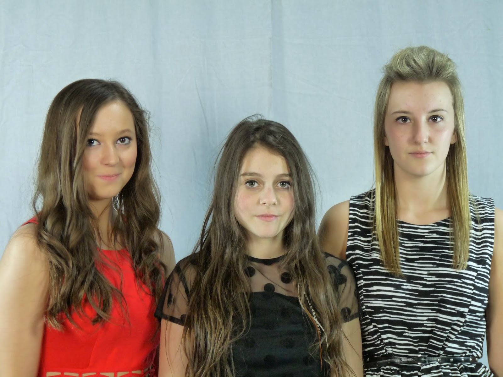
Possible Photos To Use For My Double Page Spread
I have chosen these 3 images as possibilities for my double page spread as i want the image to portray what the article is talking about, that basically being how close the girls are to each other, meaning that i want an image which looks appealing and also shows the girls happy and showing them as the best friends that they are.


Tuesday, 17 December 2013
Monday, 16 December 2013

Sunday, 15 December 2013
'Tag Line' Inspiration (Introduction Page)

This magazine introduction page was also taken out of NME music magazine. The reason i was inspired by this magazine's introduction page, was because of the tag line which has been taken from the article, to help draw the reader in, and make them want to read on into the article about them. I want to be able to use a tag line on my introduction page which will intrigue the audience, and help create more appeal to my target audience towards the magazine itself.
Saturday, 14 December 2013
Introduction Page Questionnaire Results
https://www.surveymonkey.com/results/SM-TL5BJMM/

This is my second draft of my introduction page, i have progressed by adding page number, writing down in the bottom corner the names of the people who took the images, and who interviewed them for the article. I then added the tag line above the band name, i used colloquial language in the tag line ("eva") to help appeal to the younger range of my audience.
Friday, 13 December 2013
Questionnaire: Introduction Page
Now that you have seen the first draft of my Introduction page, could you please Click here to take survey , the results will be posted soon, thank you.

Thursday, 12 December 2013
Overall Photo I Have Used For My Introduction Page

I have chosen to use this photo, as I believe it helps to show the girl group 'PIKK 'N' MIX' as I believe that It shows the 3 friends being themselves, helping to give an insight to what they're actually like to the audience, which is fitting as I intend on using this photo for the introduction page, which is designed to introduce the girl group to the audience before they read the article on the double page spread.
Wednesday, 11 December 2013
Possible Photos For My Introduction Page
I chose these 3 images as possibilities for my introduction page to the girl band 'PIKK 'N' MIX', i chose these 3 images imparticular because of the bond and the closeness of the 3 girls in the photos which is shown very clearly, and thats what i want to have on my introduction page, i want to show the girls at their most natural being together, and also i want to give the audience a good and positive first impression of them when they look at the introduction page, which comes a page before the double page spread.


Tuesday, 10 December 2013
Monday, 9 December 2013

Sunday, 8 December 2013
Contents Page Questionnaire Results
https://www.surveymonkey.com/results/SM-BSNFCMM/
 For the second draft of my contents page, i have added3 images (1 primary, 2 secondary) to show the readers what is inside the magazine. I have added page numbers, release date and the magazine companies web address along the bottom of the page. I have also added the mast head of my magazine to continue with the house style. I have added social networking sites too, so that i can appeal to the younger generation of my target audience, who use the internet and the social networks a lot of the time - this will allow them to connect with us more, and also help BEAT magazine to become more prominent in the music magazine business. I have added sub titles (FEATURES, REGULARS & BEAT REVIEW) so that it can help the audience find what they might be looking for, also it just makes my magazine a lot more organised too.
Saturday, 7 December 2013
'Layout & Format' Inspiration (Contents Page)

This contents page was taken from 'Q' music magazine. I really liker the order in which they have set out their contents page, it looks edgy and modern, and it really fits in with the house style well. I also like how in the top right hand corner they have an image of the magazines front cover, which is in a way advertising the magazine they have already purchased. The images which have been used are very effective as they are a quirky way of showing the audience what types of artists are in the magazine and what pages they are on. The primary image is larger than the other images, and is placed in the middle of the contents page to catch the eye of the audience because this artist is the feature artist. Finally i enjoy the use of magazine common conventions, such as the page numbers, dates, magazine company email address, masthead and images spread around neatly and in a professional manor.
Friday, 6 December 2013
Questionnaire: Contents Page
Now after you have seen the first draft to my contents page could you please Click here to take survey and the questionnaire results will be posted soon after, thank you.
Thursday, 5 December 2013
Overall Photos I Have Chosen For My Contents Page

I have chosen to use a picture of 'PIKK 'N' MIX' as they are the important feature in the magazine, meaning that I want them to be all over the magazine to help make the audience want to read about them.

I have also chosen to use this photo which I have called 'Lil Jay'
to make him sound like an upcoming rapper in the modern music industry. I created the name using inspiration from actual artists currently in the charts called 'Lil Wayne' or 'Lil Jon', I came up with the name 'Jay' purely from the fact that the person in the photo is called 'Joe'. I thought it would be good to show other artists which are featuring in my magazine to help draw the readers in.
Wednesday, 4 December 2013
Possible Photos To Use For My Contents Page
I chose these 3 images as possibilities, as i couldn't decide wether i wanted to have a nice sophisticated image of the girls, or wether i would be better to use an image of them messing around and having fun, and being able to show the audience the real them - which is vital as the entire article on the double page spread has the intention of letting the audience get to know 'PIKK 'N' MIX' for who they are, not just as artists.


Tuesday, 3 December 2013
Monday, 2 December 2013

Sunday, 1 December 2013
Making My Front Cover (Step By Step)
<iframe src="http://www.slideshare.net/slideshow/embed_code/34347890" width="476" height="400" frameborder="0" marginwidth="0" marginheight="0" scrolling="no"></iframe>
Saturday, 30 November 2013
Editing Photos
I started by uploading the image that I chose up to photoshop.

I then chose the 'magic eraser tool' from the tool bar along the side of the screen.

I then started removing the background bit by bit, not touching the models within the image.

Once i had removed the background, i chose the 'eraser tool'.

I used this tool to clean up edges around the models and any part of the background which could have been left behind.

Then once that was complete, i was left with my final edited image.
(This was the process i used with all of my edited images, as i only ever wanted to remove the background from them and that is all.
Friday, 29 November 2013
Overall Photos I Have Chosen For My Front Cover

I have chosen this image as my primary image on my front cover as I think it is a good way to introduce the girl band 'PIKK 'N' MIX' for the first time in the magazine. The image backs up Naomi Wolf's theory, of by using attractive women on the front cover, it sells more magazines as other women want to be like them/aspire to them and men buy the magazine because they find the women appealing.

I used this image as my secondary image on my front cover page because I wanted to continue with the theory of Naomi Wolf, and also I wanted to be able to put an image with a side story on my front cover, and so I decided to call her 'PINK!', because she is a well known artist in the charts, meaning that people will want to read about her due to her popularity.
Thursday, 28 November 2013
Possible Photos To Use For My Front Cover


I have chosen these 3 images as possibilities to use for my front cover as they all show that the models (or the girl band PIKK 'N' MIX) have a close relationship and also they look attractive too which continues in with the Naomi Wolf's theory which i aim to use.
Wednesday, 27 November 2013
Models Permission
Before I could take any photos for my cover/contents/article page i had to ask my models for permission to be allowed to photograph them and then use a selected group of those photos for my magazine.
Tuesday, 26 November 2013
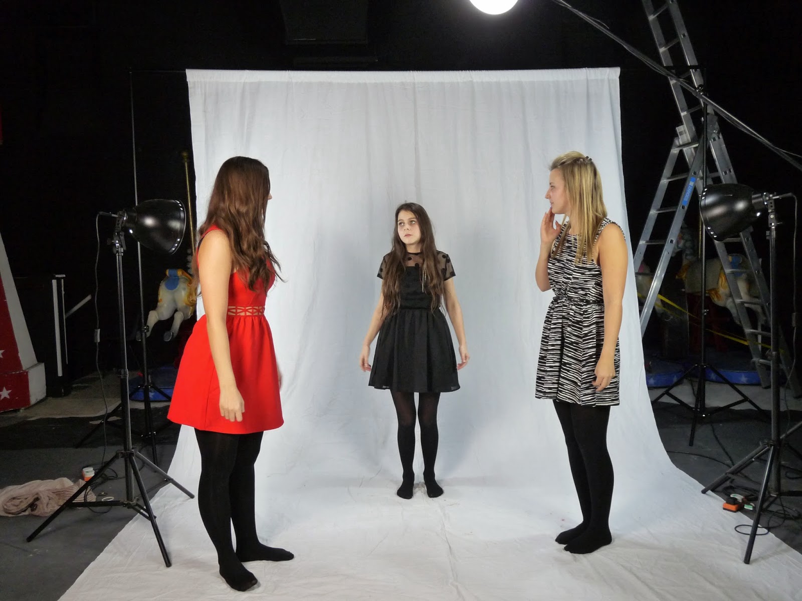
Before I Took My Photos...
Before i took my images, i had to make sure that i could capture the best quality photos possible using the facilities around me at school. We closed the curtains on our stage meaning that behind stage was pitch black and was not open to any light pollution. We set up a white photography screen (which is just a metal frame which you can then hang a very large piece of white material over it, to create a pure and cleaning background for your images. Then we used 3-4 different lights, 2 either side of the screen facing to where the models will be standing, to help take away any shadows from their faces and also to help bring out all the natural colours which could be hidden away in dim lighting. (to stop the lights from blinding the models, they had covers over them which were built in, meaning you still got the full effect from the light, but nobody got hurt) and then another 2 lights which were used to just brighten the surroundings to help balance all the lighting around and make it look natural. I would highly recommend anyone to use this equipment, as it helps you achieve the best photos you could possibly wish for meaning they look professional and effective.
Monday, 25 November 2013
More Photos...
Here is another selected group of photos which i could took and could possibly use for my magazine. When i took my photographs, i mage sure that i took at least 100 different shots so that i would have enough images to work with and it also means that i won't have to go back and take anymore images if i find a fault with one as i have more to use instead.


Sunday, 24 November 2013
Photos I Am Not Using...


The reason I have chosen not to use either of these 4 images, is due to the poor quality of them. When I was taking the images, I told my models to just mess about and I'll take photos whilst they're doing it, meaning I was always going to end up with photos that I didn't want to use. Most of these photos are blurry, meaning you wouldn't be able to see the image properly, also on a couple of the photos the models are either facing down or covering their faces meaning that it's not a good image either because you cannot see their expression/emotion, therefore it's not as appealing to the audience. Also in the each of the images above, the models were joking around with each other meaning they were laughing or pulling faces meaning that i could not use the images as an audience will not want to see that type of thing on a magazine, as it is not in-keeping with Naomi Wolfs theory that magazines sell better when using attractive women on the front of them as men buy because they are attracted to them, and women buy the magazine because they envy them and aspire to be like them.
Subscribe to:
Posts (Atom)